
Typography is more important than ever and even the subltle differences in how a font is used, it's colorization and the size can affect it's connotations and the way it is interpreted by an audience. Font facilitates the distinguishment of subject matter and appropriate demographic targetting. For one example, portraying the Incredible Hulk requires something, large, bold and prominent, as are the character's primary characteristics and most noteworthy attributes being size and boldness. The colour used, green, also anchors meaning to itself when paired with an image of the character.
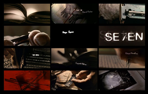
Scratched imperfect lettering jumps and lurches to the screeching score, while rough-cut, up-close footage transforms ordinary tools of reproduction— developing trays, scissors, paper, tape—into ominous devices of torture and mutilation. The profane words scribbled on the film are mixed with bits of bible prophesy and other nihilistic scrawlings. These flashes of criminal obsession— drawn from John Doe's notebooks—create an overall sense of precision and distress.
"Type is like actors to me. It takes on characteristics of its own. When I was younger, I used to pick a word from the dictionary and then try to design it so that I could make the word do what it meant…" "We made a hand-drawn alphabet and then we shot the credits…we did all kinds of experimental things with the camera when we were shooting," "In one credit there's probably twelve different pieces of a graphic." - Kyle Cooper.
The way type is described almost as alternative actors I find to be somewhat accurate but not entirely plausible. There are some instances where type are not used in opening title sequences at all, for example, Clint Eastwood has not included them in any of his films since the early 1980's. I respect Clint Eastwood as a filmmaker, director and actor and all round just a general person who knows films better than most people ever will, and go by the philosophy that they are only suitable for certain films that revolve around narrative and plot, or in films where there is a deeper meaning to be understood by the audience aside from what the see in front of them.
A LARGE, CAPITOL FONT EXRESSES AUTHORITY, POWER, LOUDNESS AND STRENGTH. THIS TYPOGRAPHY IS OFTEN UTILIZED IN WARNING SIGNS, AS ASIDE FROM THESE THINGS, IT CATCHES ATTENTION MUCH MORE EASILY AND APPARENTLY IS EASIER TO READ.
Smaller fonts are quieter, relaxed, and less ornamented and decorated so that they are easy to read. A noteworthy example is the Facebook logo, with is a minor case white coloured 'F' in a blue background.
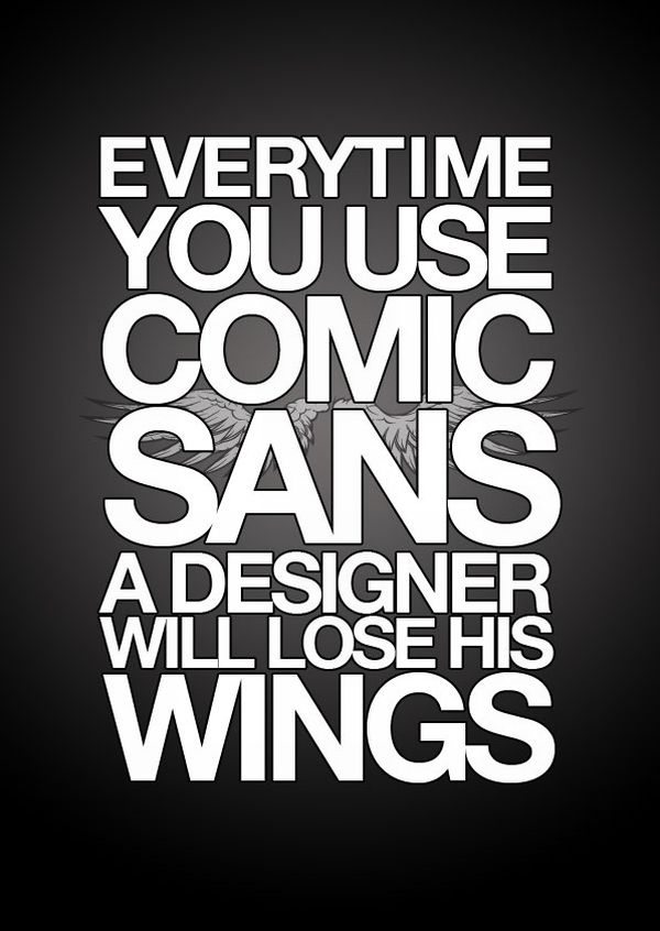
Typography is so important to some people that they go to great lengths expressing their opinions and distates regarding a font because of it's related associations. Using a font with negatively viewed associations will damage whatever the font is being used to represent.
No comments:
Post a Comment