James Cameron's Terminator 2 was hugely successful and well received by critics - producers and actors aware that the success of the first film would have audiences practically demanding a sequel. It has been among my favourite films since I first saw it many years ago and there are plenty of reasons why. But the reason why even today it is still reflected upon is the breakthrough special effects used in the film, and the filming processes used. Many processes in the film that required scaled-down models or make up would in recent times be produced through CGI, and it is insightful to see how other effects can be used to create the same result. However, models cannot be used for everything and some of the scenes in Terminator 2 are no exception to this, as demonstrated in several scenes where visually realistic animation is used to create and animate the characters, especially in the case of the T-1000.
http://www.youtube.com/watch?v=nNVjAuMg-G4&feature=related
This video goes through some of these processes; scaled down models to produce the apocalyptic Judgement Day battle between the Machines and mankind and the nuclear explosion in Sarah Connor's nightmare, but more importantly, technology used and developed to animate several scenes of the T-1000 portrayed by Robert Patrick, such as laser facial scanning to create virtual 3D models, and the scene in which he breaks into a helicopter as liquid metal and shape shifts into a metallic human. It also highlights the extent at which make up works in unison and cooperates with animation processes (at least at the time, as it may have changed now).
Thursday, 8 December 2011
Monday, 31 October 2011
An Inspirational Concept Artist 10 - Kai lim
Kai Lim's impressive artwork struck me immediately. The two particular pieces of artwork he produced that captured my attention was a development picture of a futuristic tank, and a depiction of a futuristic battlefield Typically my preferences lie with far-eastern culture and battle and have little interest in futuristic warfare but I like the battle images primarily for it's accuracy and realism, it almost looks like a screenshot from a scene out of a high-budget film. I also like the colour code indicating parts of the tank - something I almost definitely want to use in my future projects.


An Inspirational Concept Artist 9 - Louis Thomas
Louis has produced this much more simplistic concept art for what appears to be for a personal project. This artwork would be much quicker and more efficient to produce, and if one was developing a 2D character a similar stylization, there would be little more necessary than what is here to produce an accurate portrayal of the character. The exaggerated facial expressions are almost human but retain non-anthropomorphic properties. The artwork is similar to styles seen in children's books or animated cartoons.


An Inspirational Concept Artist 8 - Takashi Ishihara
I found this amazing colourful concept art produced by Takashi Ishihara that is a clear and prominent reminder that colour in art can be powerful and inspirational; this is some of my favourite artwork I have seen and among the artists I have not placed this among the art considered not blogging about, as I knew I wanted to share it. I find the artwork colourful, portraying futuristic neon-like lightscene, and magic landscapes. I think what brings the colours out the most are the black backgrounds.


An Inspirational Concept Artist 7 - Vaughan Ling
http://vaughanling.blogspot.com/
I found Vaughan's work original and very realistic, and whilst my preferance is not in futuristic artwork, I appreciate and respect the level of detail and effort that goes into his work. I believe another commendable and noteworthy feature, aside from the realism in his work which I think might be due to the metallic reflections and portrayal of textures, to be the style of his development.


I find Vaughan's work to be inspiring and insightful into the world of 3D concept art.
I found Vaughan's work original and very realistic, and whilst my preferance is not in futuristic artwork, I appreciate and respect the level of detail and effort that goes into his work. I believe another commendable and noteworthy feature, aside from the realism in his work which I think might be due to the metallic reflections and portrayal of textures, to be the style of his development.

I find Vaughan's work to be inspiring and insightful into the world of 3D concept art.
Metal Gear Solid Animation
I came across a fan-produced animated short from TheDuoGroup. It is based on the Metal Gear series. I like the style of animation as a method of storytelling and portraying the narrative as the past, rather than the present or future, despite what we see is happening in the present. Most of the shots consist of pictures that seem painted, the landscapes and characters artistically depicted, rather than finely detailed for a sense of realism. What I also like about the animation is the effects used over it that arn't hand drawn that do add a sense of realism to the animation such as the warmth breath in the cold air, the snowfall and the sound effects.
I think this is a well considered and enjoyable animation, and whilst not exceptional, it is admirable and praiseworthy. What I would do to improve it is add a few more scenes and slides dedicated to showing the progression of character movement. For example, the part where the infiltrator raises his hands. This may have been an intentional decision to leave out this animation as part of the artstyle, but my preferance would be to have more movement.
(theduogroup.com)
Tuesday, 25 October 2011
An Inspirational Concept Artist 6 - Levi Hopkins, Dorian Progression
Guild Wars 2 is a game in development that I am currently anticipating. I decided I would carry out some research on the concept artist behind the game, given that some of my favourite names in the games industry are behind it already; for example, several members of Blizzard broke away and formed the company that produced Guild Wars; and Jeremy Soule is producing the soundtrack, who also did work for the Baldur's Gate, Neverwinter Nights, and Oblivion series - all of which have been rated well.
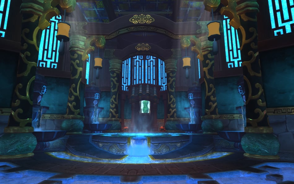
Levi Hopkins produced artwork for Guild Wars 2 and I now find myself even more knowledgeable in the varieties of landscapes and areas I may come across when I come to play the actual game; the environments are well portrayed and there is a good mix of light and shadow in the picture that sets a dark atmosphere.


I especially like the landscape painting above because of the angle of the shot and the depiction of an almost pastoral scene, and how the river in the landscape is portrayed with only a few lines and a fine mist works well with the rest of the drawing because of the distance, and the birds flying through the air bring the scene to life.
My progression on my self-created character Dorian Dolosus is progressing well still and I have made further developments and improvements to the character. I thought I would share some of the background from my character sheet that I produced as the original, first concept. Not much has changed from my first and earliest descriptions and ideas of Dorian, but it has been refined and perfected.

Levi Hopkins produced artwork for Guild Wars 2 and I now find myself even more knowledgeable in the varieties of landscapes and areas I may come across when I come to play the actual game; the environments are well portrayed and there is a good mix of light and shadow in the picture that sets a dark atmosphere.
I especially like the landscape painting above because of the angle of the shot and the depiction of an almost pastoral scene, and how the river in the landscape is portrayed with only a few lines and a fine mist works well with the rest of the drawing because of the distance, and the birds flying through the air bring the scene to life.
My progression on my self-created character Dorian Dolosus is progressing well still and I have made further developments and improvements to the character. I thought I would share some of the background from my character sheet that I produced as the original, first concept. Not much has changed from my first and earliest descriptions and ideas of Dorian, but it has been refined and perfected.

Family Background Dorian had one brother and one sister. His mother died at childbirth. His brother, Chaser, was framed by Dorian for practicing dark magic – as the older brother he was due to inherit the Dolosus family fortune instead of him. Dorian had his father poisoned and had a member of the royal family framed as the poisoner assassin. As head of the family in absence of his father, Dorian had his sister married off to a prince in order to be more private and get a step closer to the Royal Family. Dorian then founded a secret cult that publicly disgraced and mock the Royal Family by exposing scandals and secrets and that they should find a new leader, which prompted the War of the Pure. In this war, Dorian became a war hero and the public’s opinion of him rose to unprecedented heights. In the public eye Dorian is a successful entrepreneur, sponsor, businessmen, nobleman, mage and professor, as well as an extension of the Royal Family and officially 15th in line to the throne. On the inside, he endorses smuggling, illegal goods trading, and gambling and underground combat, all of which he makes a profit on, which he uses to secretly shame the Royal Family and attempt to have them ousted, then claim the throne for himself.
|
An Inspirational Concept Artist 5 - Min Yum
Min Yum is an artist who's work I came across recently and I found some of the artwork produced to be very detailed and inspiring, and the artwork succeeds in setting a certain mood that the artist is intending to convey. Min Yum's work differs to other artists I have seen so far because of this very high level of detailed illustration, which are almost photoreal in their accuracy of shading, lightning, and portraying textures.

The pictures also manage to let some of the narrative become realized; each of the pictures holds some sort of story. Whilst the details of the story are unimportant, the nature of it is composed by the character's positions, and what they are doing.

There is another piece of artwork Min Yum produced that doesn't hold the same level of detail but I still find it accurately portrays the scenery and landscapes. I feel that the level of detail in the pictures above, whilst I can appreciate and admire it, is somewhat unneeded.
The pictures also manage to let some of the narrative become realized; each of the pictures holds some sort of story. Whilst the details of the story are unimportant, the nature of it is composed by the character's positions, and what they are doing.
There is another piece of artwork Min Yum produced that doesn't hold the same level of detail but I still find it accurately portrays the scenery and landscapes. I feel that the level of detail in the pictures above, whilst I can appreciate and admire it, is somewhat unneeded.
Monday, 24 October 2011
Environment Design
Blizzcon, Blizzard Entertainment's games convention, was held over the recent weekend and some interesting pictures were revealed of their work-in-development that I found relevant to my own work. It included plans and designs for environments and gave me a good idea of industry standard environment planning, which gave me useful insight into what else I should include if I produce more environmental design work.


Some of the features I like the most are a short preview of the 'side view' from a different angle, as demonstrated in the plan above. This would give the game developers a better idea of the perspective and general appearance of the area that would otherwise not be informed. I would appreciate extra knowledge such as this when designing an area as a commission and would greatly consider using it myself.
Blind; Machinima
Another excellent machinima I came across was Blind, made by 'Percula'. It uses existing models but animated by importing the models into a program such as 3D Studio Max, where the machinimator has made custom animations for more detailed and realistic choreography.
Fight scenes are definitively my favorite ways of displaying animation as there is a lot of action and movement involved. This is among my favorites of animated fight scenes I have seen. Aside from this, I find the narrative interesting, as it becomes unclear on whom is the narrative or the antagonist. The choice of camera angles used, and use of sound effects is also good, but even more interesting is the lack of speech, which makes it almost seem like a instrumental music video.
High quality and animated machinima such as this is much more demanding to produce and requires a much higher investment of time, and perhaps money too - as conventional machinima could be made with little more than free software such as Fraps and Windows Movie Maker.
Wednesday, 19 October 2011
Global Agenda: Machinima
Machinima is producing an animation from a video game. Often, players and machinimators will use pre-set in-game character animations to act out actions or script, but the developers of Global Agenda, Hi-Rez, released this machinima video as an announcement that the game would be following a new business model of 'Free to Play'. Rather than release this information as a boring list of words, it is both entertaining and informative.
The Making of 'Pop Song'
John Lajoie is my favourite comedian. This behind-the-scene footage documents the creation of a music video for his pop-culture parody song entitled 'Pop Song'. I found it interesting given the subject matter and the techniques used and processes undertaken. The studio that produces it is not a high budget and neither is the video and accurately demonstrates what is achievable with a lower budget in comparison to heavily invested music videos, and the extensive possibilities when using green-screen filming.
I also hate pop music.
I also hate pop music.
An Inspirational Concept Artist 4 - Yuji Shinkawa, Character Progression
Japanese artist Yuji Shinkawa produces concept art for one of the most successful and one of my personal favourite game franchises of all time; Metal Gear Solid. The artwork is unique and has an instantly distinguishable stylisation. This is primarily what I like about his work the most. As a concept artist I feel his work is more agreeable as conceptual, because of the somewhat vague portrayals of the subjects in his art. The reason behind why I feel this works well is because it connotates movement and action, rather than a standstill, posed picture. It also allows the viewer to form their own conceptions of the subject.


Shinkawa is definately one of my most idolized concept artists for his contributions to the Metal Gear Franchise and portrays protagonist Snake exceptionally well, and is interoperated in-game just as he is depicted in the work, without any personality missing.
On my project, I've gone a good distance and developed this picture that portrays Dorian and reflects his evil personality, to better convey his nature and dark aspirations. I made the background with a photoshop filter effect used in combination with gradient and brush effects. I produced the fire effect by using a photo of a large fire and erasing it until I achieved the desired effect.

On my project, I've gone a good distance and developed this picture that portrays Dorian and reflects his evil personality, to better convey his nature and dark aspirations. I made the background with a photoshop filter effect used in combination with gradient and brush effects. I produced the fire effect by using a photo of a large fire and erasing it until I achieved the desired effect.

Sunday, 16 October 2011
Animation Choreography
Amongst the many cartoons and animations I grew up with, my favourite and the one that inspired me most was Samurai Jack. The far-eastern setting intertwined with a retro future and unique artstyle are unforgettable and I was already familiar the director, Genndy Tartakovsky, for his previous work with Dextor's Laboratory. He also directed the Star Wars: Clone Wars animated series, where the same similar art and animation style are employed.
Alongside these reasons, as to why I rank Samurai Jack as my favourite animated programme of all time, i s the choreography within it, during the fight scenes and the realistic quality of the animated movement the characters perform. Protagonist Jack excellently demonstrates this throughout the entire series with a multitude of weapons, fighting styles, scenarios in various places against a vast array of enemies.
I was able to find a documentary that explored the process and source of the choreography within Samurai Jack and found it very informative. I would definitely like to produce an animation which included some choreography in a fight scene as I find well-executed and well animated fight scenes to be very entertaining and inspiring.
Below is another video demonstrating the full fight scene of Jack versus a vast army of undead. I admire the many strange and unsettling sound effects used for the undead, atmosphere, and various other sounds of diagetic and non-diagetic nature - sounds that are part of the scene such as swords clashing and scraping, and sounds that are not, such as the music.
Sunday, 9 October 2011
An Inspirational Concept Artist 3 - Matt Rhodes
Matt Rhodes produced concept artwork for EA / Bioware's RPG "Dragon Age 2". The characters he developed were modelled almost perfectly accurate to the concept art which is an achievement in itself but the range of ideas within the clothing, weaponry, aesthetic, and features such as hairstyles, body shape, gender, height and clothes are all well considered, making him an idealistic character designer. First, the initial character designs. 4th from the right is Bethany, who's short blonde hair was changed in game - but Varric, to the very left, and the character next to him, appear as they appear in the artwork to an uncanny resemblance.


I have been a fan of RPG games for a long time, such as Bioware's previous titles like Neverwinter Nights and Baldur's Gate. The concept art I have seen of them so far has never been disappointing and the ideas from the concept art have been transformed into much more than just ideas.
An Inspirational Concept Artist 2 - Andree Wallin
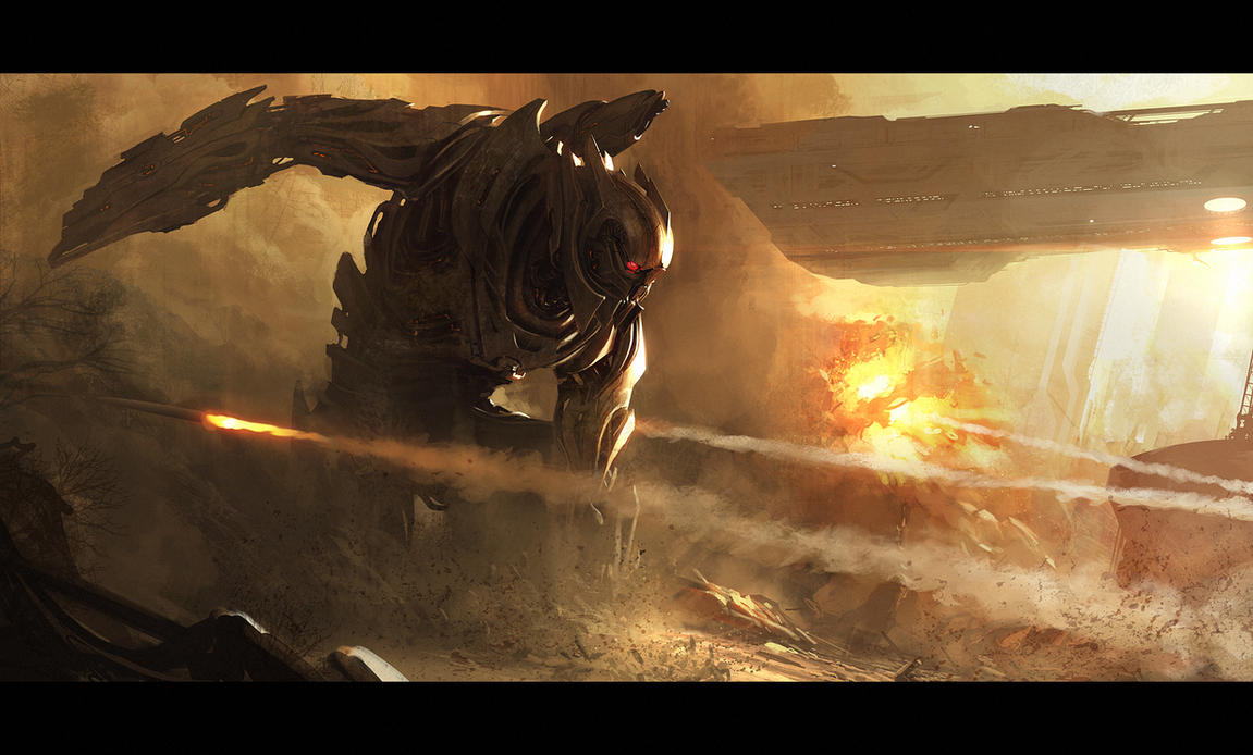
I find myself inspired by concept artists, as I mostly think of them as producing sketchy, vague work that will be built upon and built upon until what is wanted is eventually achieved. Yet I see, and realise now that concepts artists can already put much detail into their work, and I suppose makes them much more than mere 'concept' artists. They may introduce the concept but they take it two steps further.
Andree Wallin is a concept artists who's work I admire for it's styalized colouring, and range of both Edo-Japan styled landscapes and futuristic depictions of cities and sceneries. The work very clearly demonstrates the kind of landscapes, atmospheres and time that the architecture or characters within it might be set, and I find it agreeable to say that each picture has it's own story.

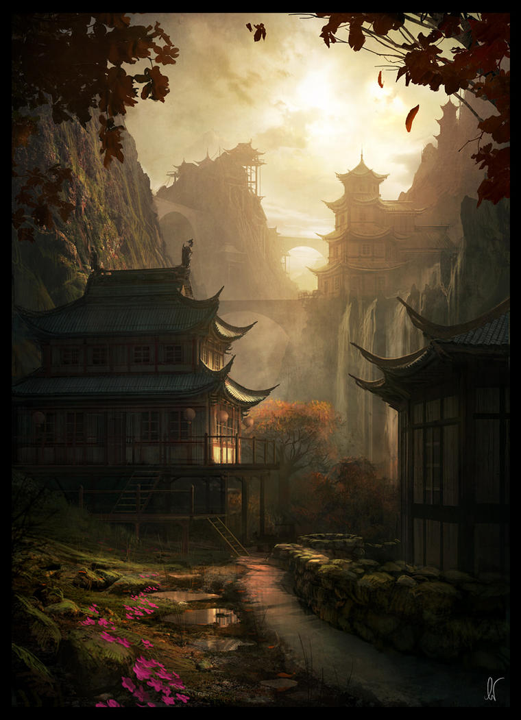


Andree Wallin is a concept artists who's work I admire for it's styalized colouring, and range of both Edo-Japan styled landscapes and futuristic depictions of cities and sceneries. The work very clearly demonstrates the kind of landscapes, atmospheres and time that the architecture or characters within it might be set, and I find it agreeable to say that each picture has it's own story.
ALL ARTWORK ABOVE BELONGS TO ANDREE WALLIN
http://andreewallin.deviantart.com/gallery/1558764
http://andreewallin.com/
All credit for the above artwork under "Inspirational Concept Artist 2 - Andree Wallin" goes directly to the artist. I do not claim to own any of the above artwork.
Thursday, 6 October 2011
Dorian's Progression
The character's backstory is fully fleshed out and each perk, characteristic and noticable feature Dorian has can be explained and has a detailed history. I have also come a long way in how I portray Dorian, as I had some trouble conveying his malevolent nature. However, by hiding his eyes he has a much more mysterious appeal. I produced some T-pose pictures using photoshop that I believe portray him very well. The front-view was much quicker and easier to produce given I produced the side-view first and got more experience with using photoshop to fully produce images.


The pose from behind was relatively easy, if not overly simplistic to produce. given he wears a cloak. When I come to produce it I decided I would likely add some sort of detail as I did with the grey sleeveless jacket Dorian wears under the black robe, but instead went with a shading effect that illustrated the cloak well, by demonstrating some sort of movement.


The pose from behind was relatively easy, if not overly simplistic to produce. given he wears a cloak. When I come to produce it I decided I would likely add some sort of detail as I did with the grey sleeveless jacket Dorian wears under the black robe, but instead went with a shading effect that illustrated the cloak well, by demonstrating some sort of movement.

I also learned that Dorian's primary stylised image and recognizability comes from his hat; that even as a silhouette, one would recognize him if he had the hat on.
Here are my 6 favourite images from my outing to the mueseum, as well as why I believe they were the most helpful.


The architecture in the first photo had me thinking of the Victorian times- regardless of whether it was the Victorian era or not, it undoubtedly helped. The second photo seems like a private study, where I got the idea of Dorian being a studious, smart person. The fourth photo gave me the idea he might have a large house, mansion, or manor as his home, and that he is very wealthy - the idea of which came from that photo and the fifth photo. The sixth photo, of the stained glass windows, seemed to have old family crests on it, and inspired me with the idea that my character could be noble born and upper class. The third photo I disregarded at first but now I consider it important because of it's realistic portrayal of a man of the times, holding a dangerous weapon. I took many photos of guns and considered giving Dorian a gun but decided he would use magic in a place.
Thursday, 29 September 2011
Photoshop

During my next photoshop session I was able to use a Wacom pen tablet and produced several images portraying Dorian, my developed character. It is my first time using a pen tablet in a long time and given my inexperience with it I am proud of my accomplishment. I feel I could do much better if I did it again however as I learned many techniques and shortcuts that would produce better artwork, that I learned through trial and error when producing this picture. I know with confidence that the next few pictures I produce on photoshop will not only look better but will be produced quicker altogether.


Tuesday, 27 September 2011
In trying to portray Dorian the way I want him I've had some trouble with how. I picture Dorian without his hat, where he is kind, even gentle; deceiving everyone and completely the opposite of his real, hidden nature; a malevolent, evil, plotting trickster who is really smiling at the thought of the guard he had tortured for fun. When his hat lowered, and covered his eyes, his appearance changes completely, and instead of a regal clothed mage, he becomes a shrouded necromancer, a silhouette of wickedness.
I've found that by giving him a bigger mouth than I would usually give a character, his smiles appear bigger and friendlier, without seeming too forced when the hat is lifted. When his hat is lowered and his eyes are no longer visible again, I find that the effect instantly becomes one of secrets, that the character knows the secrets of everyone around him and is able to expose them at any moment, a wolfish, predatory grin.
I am personally surprised at how subtle a change can make such a noticeable impact on not only the character but the thoughts that he conveys.

Here are some of the photos I took whilst at the muesuem, collecting images that would help inspire and develop Dorian as a character.


Subscribe to:
Comments (Atom)