'There is no time like the present to begin forging an image that is sure to sway our hearts, but remember that any images you submit must wholly be comprised of your own, original imagery, must exceed a resolution of 1600 x 1200, and may be no larger in size than 5 MB.'
Having fulfilled the criteria of entry
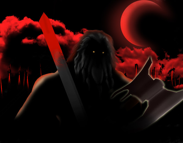
this is the piece I produced. I believe my work depicts the barbarian character
in a fitting manner. The concept was to have him in the aftermath of a bloody
battle, fighting off the various demons and monsters that can potentially tear
out your throat in the world of Sanctuary. I used my own experience within the
game to draw some criteria I wanted to meet,as well. The character wears no
armour because I feel it is more fitting of the barbarian character, as does
his wielding of two weapons rather than one. I wanted to give him a helmet but
I felt like I would be drawing the armour, rather than the actual character,
and I the character almost instantly recognizable through his facial hair. His
body is little more than a silhouette which I think I could have improved upon
with more subtle lighting from surrounding fires. Arguably the outline of his
body, and the appearance of his hair with his two weapons, makes this character
instantly recognizable as the Diablo III barbarian character. I had several
variations and additional layers but ended up removing or not using them. Here
is the presence of one layer and I thought I would take a moment to explain it.
In this version the barbarian wears a
single shoulderguard. It is meant to be fur or leather with a steel skeletal
structure surrounding it, however I was having a hard time depicting the
structure as I wanted to portray it and in the end I felt it detracted from his
overall appearance and silhouette. I also had the axe removed for the same
reason, at the time. I feel it is less characteristic of the character to only
have a single weapon.
This was the sky that I had created.
Initially the moon was on the left but from the way I had organized the layers,
it looked like the moon was in front of the clouds rather than behind them. It
also created an imbalance in that the focus of the picture was on the left and
there was far too much empty space on the right. In order to re-balance it I
shifted the moon to the other side of the picture and made it a larger,
crescent moon.
All in all I never thought I had much of
a winning chance, but I did learn a things when putting myself to the task. I'm
proud of how I manged to produce the barbarian's hair. Although it was a slow
process I could do it quicker next time as I have the practice. I'll be using
it more often. This overall was an important lesson for me because I have
thought previously about going back to basics so that is what I decided to do,
take my time and build up the drawing over layers from the back to the front,
rather than trying to jump in. I could have done more to augment the silhouette
with additional detail, but that is another criticism I can reflect and act
upon in the future.


No comments:
Post a Comment